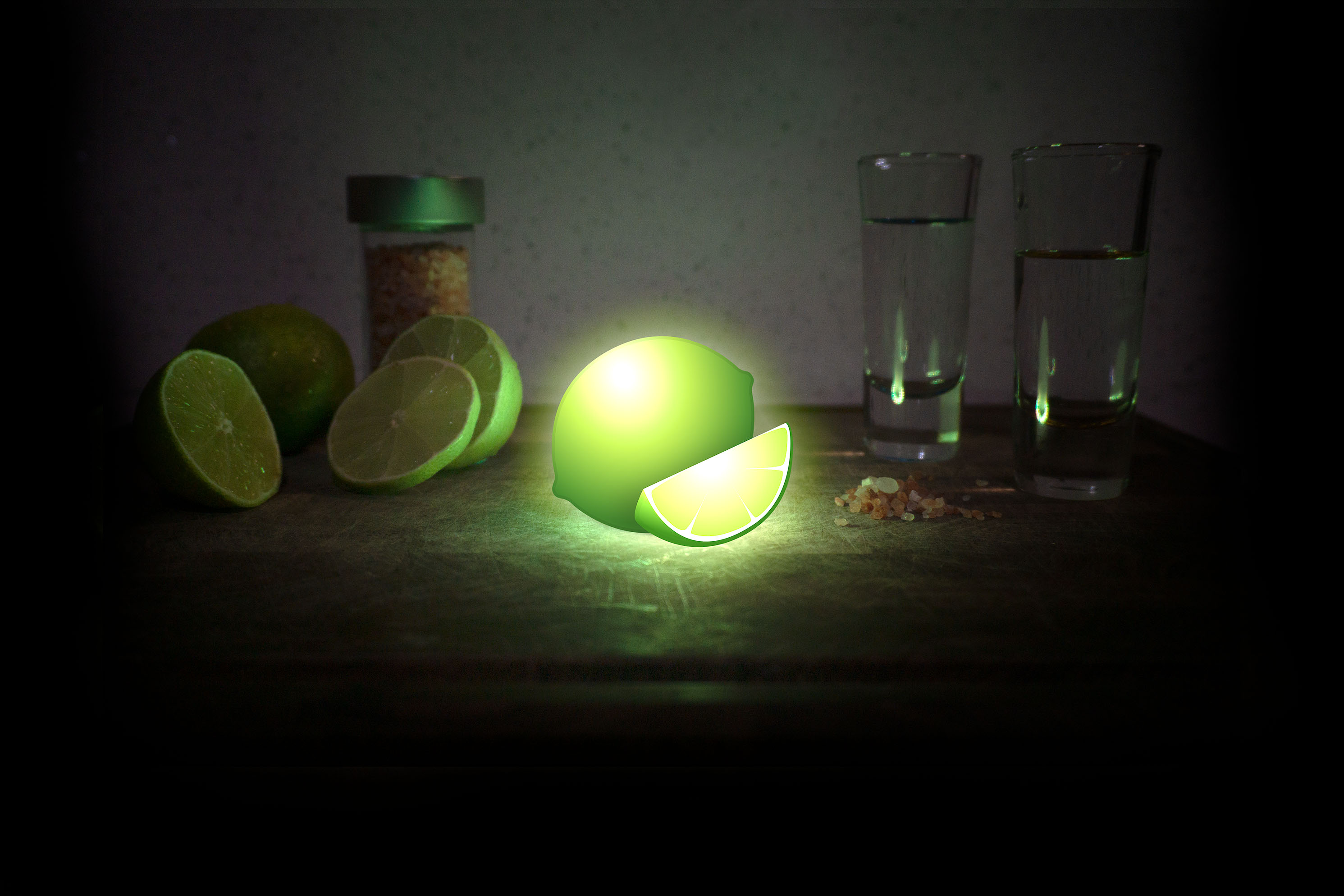
So there you are…half a text message away from a perfectly planned weekend. You pop open the emoji window and scroll your way into the food and drink aisle. “Lime emoji + Coconut emoji” you think to yourself. What could be a more masterful way to communicate your Saturday night plans? Only to realize the gaping void that exists among our trusty illustrated emoji companions… Where is the damn lime?
Don’t Panic
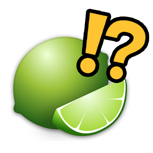
“Of course, there should be a lime emoji! How could there not be!?” You’re not alone. This happens to people all the time.
It’s a staple of many iconic foods and drinks; it’s of great cultural importance to nations around the world; it’s one of the oldest citrus fruits to have been cultivated by humankind! And yet we’ve made it all the way to 2021 without having an adorable pictographic representation encoded into our phones.
There’s an solution, I promise
The good news is, this isn’t the first time something like this has happened. Actually, it’s quite common. The emoji system is managed by the Unicode Consortium, a standards-keeping organization comprised of industry leaders within the tech field. Their primary role is the encoding of fonts so that text sent from one computer to another gets properly displayed. Similarly, the Consortium makes sure when you send a 🤣, the person on the other end of the line doesn’t read it as a 😭. But they’re also in charge of deciding what reaches the coveted status of emoji, and what you’re doomed to type out l e t t e r by l e t t e r.
It’s a lot of responsibility, and the Unicode Consortium isn’t turning a profit by doing it. So it’s understandable that some symbols might take a little longer to get added. The 🌮 for instance wasn’t adopted until 2015; and the 🛻 didn’t arrive until just last year in 2020. Getting these symbols added to the emoji rolodex was no small task either. Getting each of these symbols included was a coordinated effort between teams of designers, marketers, and a Fortune 500 company to back them (Taco Bell and Ford respectively).
Of course, this is not a Fortune 500 company, and I’m not pushing a product or agenda. So how does a regular person like myself convince the Consortium to add a lime emoji? It’s easier than you think (kind of).
Time to make a lime… emoji
The Unicode Consortium has an emoji proposal process that is actually designed for people like me! Emoji submissions are open to the public and the Consortium meets yearly to review proposals and vote on emojis for inclusion. If a proposal makes a particularly good case for the emoji and the Consortium votes it into the standard, it will receive a “code” and a CLDR (Common Locale Data Repository) name. In short, it becomes an emoji.
First, we need an image. You might have noticed that emojis on iPhone look a little different than on Android or Windows. Each company makes its own version of the emoji, so the image in our proposal only needs to be a proof of concept. However, we still have to make some serious considerations for our design.
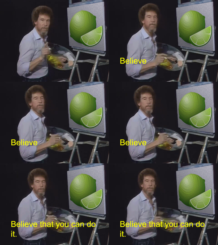
What to consider when designing an emoji:
It should be easily identifyable
Although your design likely won’t end up on any phones, it will still be an influential piece of reference material for the designers working at Apple or Google. Make sure it’s easy to identify and won’t be confused with existing symbols.
The image needs to look good small (like really really small!)
Emojis are typically displayed at 72 x 72 pixels or 18 x 18 pixels. The former is easier, but making the latter look good is a challenge.
It should be recognizable in black and white
Emojis also need to be readable when they are displayed in black and white. Not to be confused with grayscale, the Unicode Consortium requires all emojis to be easily identifiable using only black and white.

Putting it all together
Once you’ve crafted an emoji design that is just the right combination of timeless and adorable, you’re ready to put together your proposal. This might be the most difficult part of the whole process. It’s not enough to simply want an emoji, you actually need to prove that there’s a need for it and that others want your emoji as well. The proposal is rigid yet straightforward but isn’t too hard to follow. Clerical errors are one of the top reasons emojis aren’t considered for inclusion. So double-check that proposal before clicking the submit button!
Back to my story
All this being said, I’ve submitted a proposal for the lime emoji to be included in the next emoji revision. The deadline to submit new emojis is August 31, 2021 and the symbols selected for inclusion will be announced in October.
If all goes well I’ll be sending lime emojis to the squad in no time ![]() 🍹. If not, we’ll have to wait a full TWO YEARS 😲 before another proposal can be submitted for the lime emoji after it has been rejected. My full proposal is linked below for anyone else who’s looking to make some emoji magic.
🍹. If not, we’ll have to wait a full TWO YEARS 😲 before another proposal can be submitted for the lime emoji after it has been rejected. My full proposal is linked below for anyone else who’s looking to make some emoji magic.
You can hit me up with some “fingers crossed” emojis on Twitter to wish me luck! 🤞🤞
#ItsAboutDamnLime
Nicholas Antonio

